The 5 Best Wedding Invitation Color Palettes of 2026
Planning a wedding for 2026? One of the first ways you’ll introduce your wedding style to guests is through your invitation suite. As we look ahead to this year’s trends, wedding invitation color palettes are evolving in exciting new directions. Did you know that your wedding color choices can reveal a lot about your personality?
So let’s dive into my predictions for the best wedding invitation color palettes for 2026, based on what I’m seeing in the industry and what my couples are already requesting. Whether you’re drawn to timeless elegance or want to make a bold statement, these trending palettes will help you set the perfect tone for your celebration.
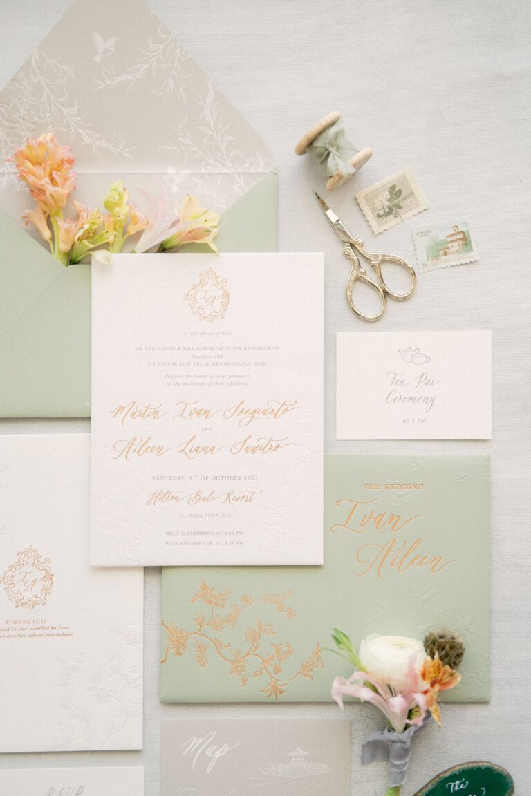
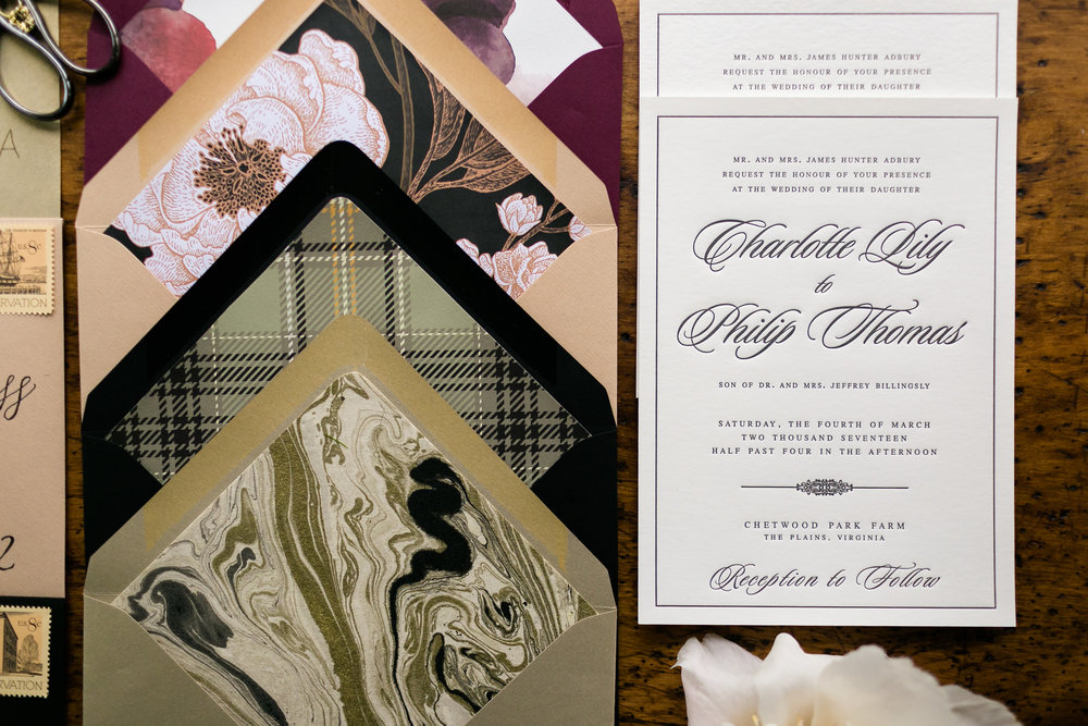
1. Earthy Neutrals with Modern Warm Accents
Earthy neutrals remain a favorite in 2026, updated with modern warmth and sophistication. Warm tones like terracotta, clay, and warm beige pair beautifully with Pantone’s 2026 Color of the Year, Cloud Dancer, which provides a soft, airy neutral base. Metallic accents in brushed silver, pewter, or muted gold elevate the palette, while textured papers and natural fibers add depth and dimension. This versatile palette works for rustic outdoor weddings, minimalist urban celebrations, or cozy fall and winter events.
Who should choose this palette? Couples who love organic elegance with a contemporary twist.
2. Island Citrus and Tropical Brights
For couples who want bold, energetic invitations, 2026 brings Island Citrus, a lively yellow-green, front and center. Pair it with tropical shades like coral, aqua, or fuchsia to create a vibrant, joyful palette that immediately sets a celebratory tone. This palette works beautifully for summer weddings, beach celebrations, or destination weddings where the energy of the location is reflected in the stationery.
Perfect for: Couples who love fun, modern, and playful designs.

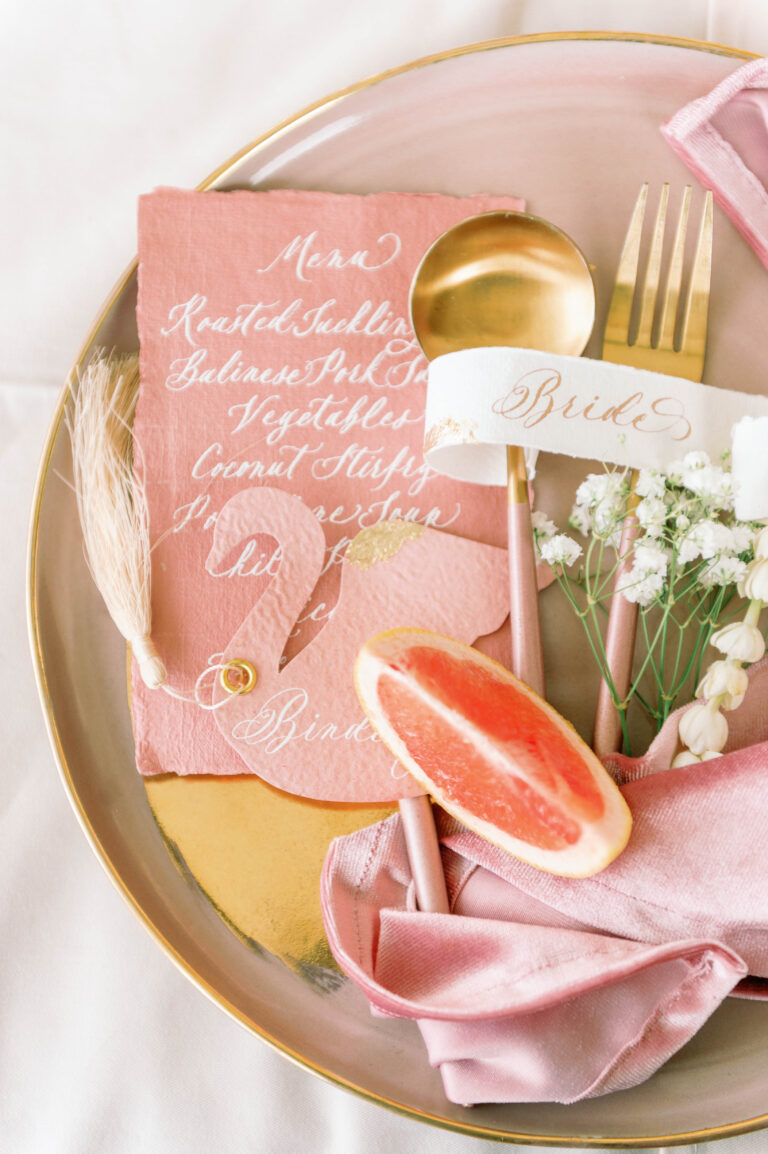
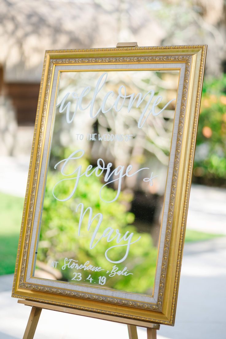
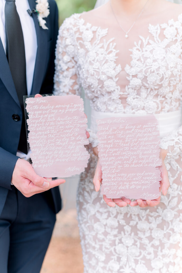
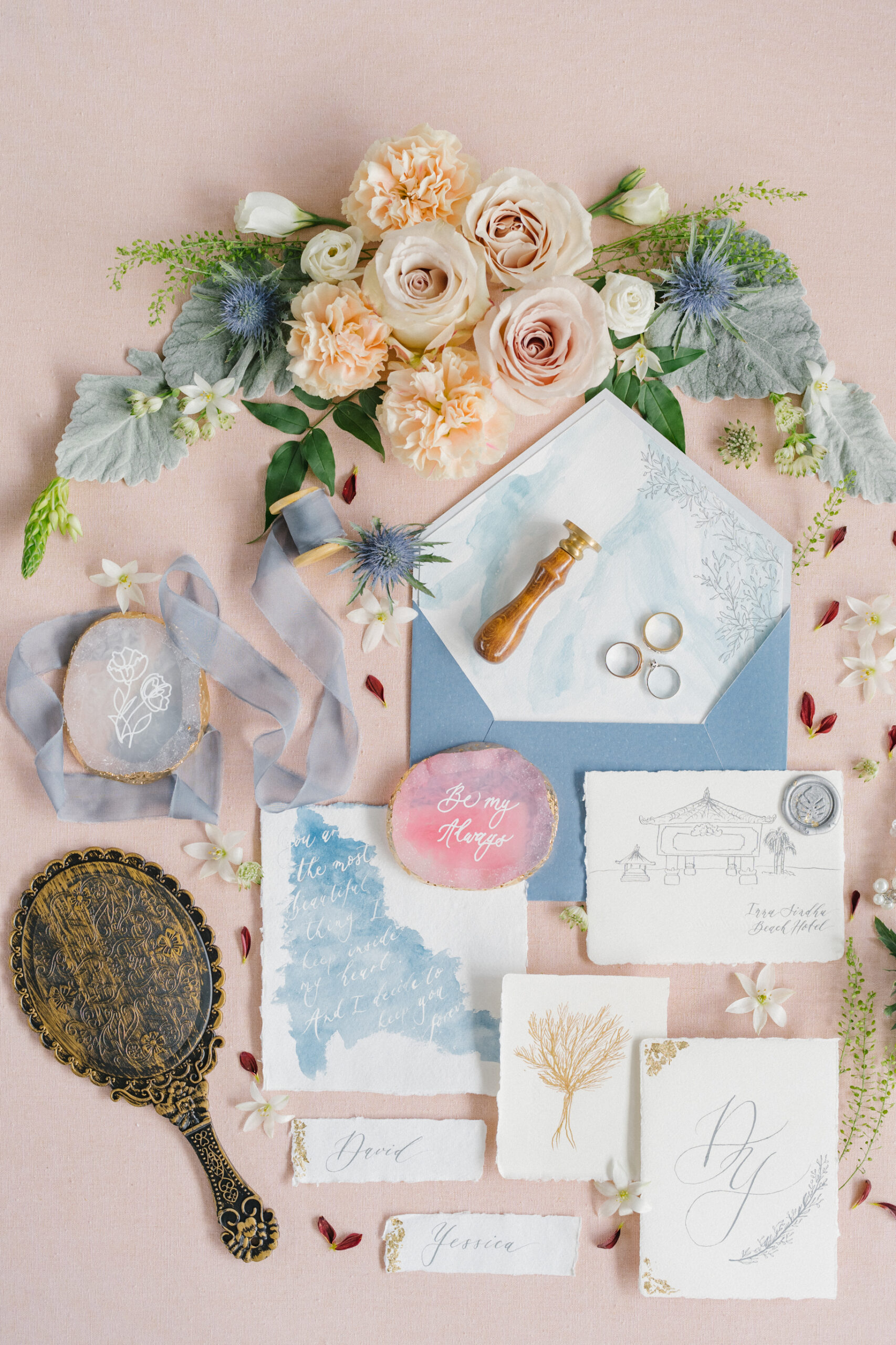
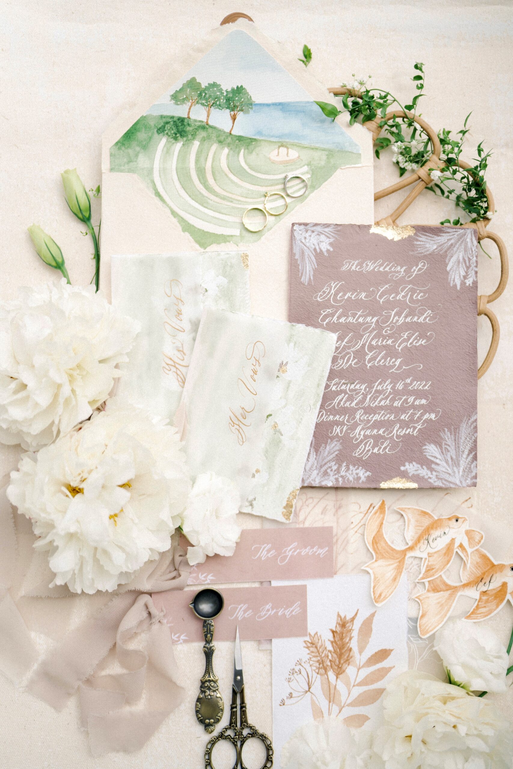
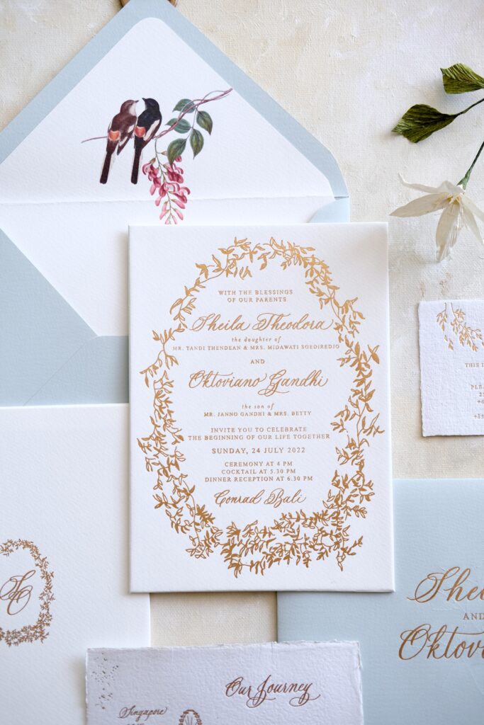
3. Soft Pastels and Cloud Dancer Neutrals
For dreamy, romantic weddings, soft pastels continue to shine in 2026. Colors like blush pink, lavender, dusty blue, and mint green pair effortlessly with Cloud Dancer to create an elegant, airy look. Add subtle metallic foils or watercolor textures to elevate the invitations while keeping the design soft and sophisticated. This palette is especially popular for spring and summer weddings.
Perfect for: Couples seeking a romantic, delicate aesthetic with timeless charm.
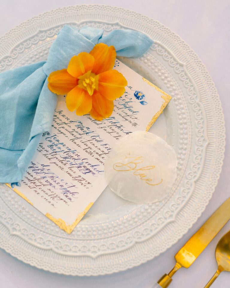
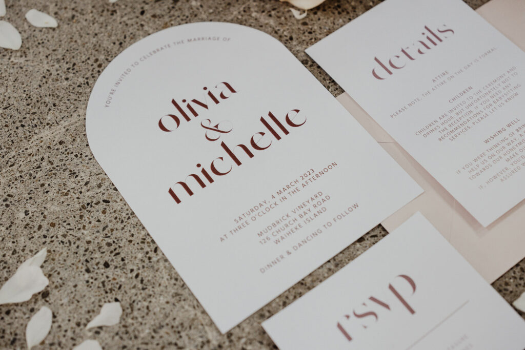
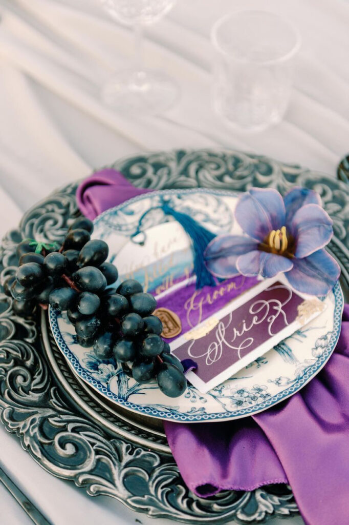
4. Fine Art-Inspired Jewel Tones
Couples looking for dramatic, sophisticated stationery are embracing jewel-inspired palettes. Deep emerald green, sapphire blue, rich burgundy, and amethyst create a luxurious, old-world feel. Accents in gold foil or matte copper add opulence, while textured or deckled-edge papers give the suite a tactile, gallery-worthy quality. This palette pairs well with classical venues, historic estates, or black-tie evening weddings.
Perfect for: Couples who love luxury, depth, and timeless elegance.
5. Earthy and Coastal Fusion
2026 also sees the rise of palettes that combine nature-inspired earthy tones with soft coastal hues. Think sage green, warm sand, driftwood beige, and pale aqua. These shades are ideal for outdoor, seaside, or botanical weddings, especially when paired with organic textures and metallic accents like gold or bronze. The fusion of earth and water tones gives a serene, modern feel that’s perfect for relaxed yet stylish celebrations.
Perfect for: Couples who want a natural, grounded palette with fresh coastal energy.
How to Choose the Right Palette for Your Wedding
When selecting a color palette for your wedding invitations, consider these factors:
Venue and setting: Your venue might suggest certain color directions. A garden wedding might call for softer tones, while an industrial space might pair well with bold colors or metallic accents.
Season: While seasonal “rules” are increasingly flexible, consider how your colors will feel in context. Bright Verona Sunset might feel more natural for a summer wedding, while rich jewel tones might better complement a winter celebration.
Personal style: Ultimately, your invitation should reflect your personality as a couple. If you love bold colors in your everyday life, a vibrant palette might be perfect regardless of season or venue.
Wedding vision: Your invitation sets expectations for your event. The colors you choose should align with the overall atmosphere you want to create.
Printing method: Different printing techniques reproduce colors differently. Letterpress tends to create slightly muted tones, while digital printing can achieve more vibrant hues. Discuss these nuances with your stationer.
Conclusion of Best Wedding Invitation Color Palettes
I hope these 2026 wedding invitation color trends have sparked some inspiration for your own celebration! Remember, while trends can provide great inspiration, your invitation should ultimately reflect your personal style. Don’t be afraid to customize these palettes to suit your vision – the most successful wedding stationery tells your story in a way that feels authentic to you. If you’re looking for more tips on designing the perfect wedding invitation, be sure to check out my guide on how to design wedding invitations for 2026.
I’d love to hear which palette speaks to you! Drop a comment below and let me know which colors you’re considering for your 2026 wedding stationery. And if you’re looking for more personalized advice, I’d be thrilled to help bring your color vision to life!